Fashion File Challenge #5

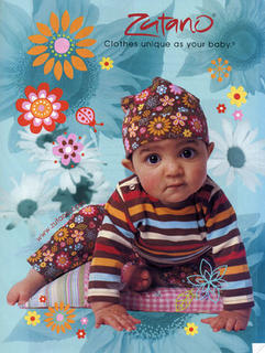
Maggie and Robyn chose this ad for this week's fashion file challenge. Fun!! Here is my layout. 
I used the KI paper that the baby's hat immediately reminded me of. The background is a light aqua, and I just cut some stripes from a dark aqua and pink. I wanted to get away from the straight lines, though, so I freehand cut some little swoopy pieces from orange. The flowers are from Deluxe Designs, the photo turns and brads are from Creative Impressions, the Cutie and Girl flower centers are old Scrapworks Hugs (using my stash.. yay!) and the stickers are American Crafts and Provo Craft. The journaling is made with my Dymo labeler.
The left side stubbornly refused to scan straight... that photo is straight in real life!


6 comments:
Darling layout! I too thought of that paper when I saw the piece - they looks almost exactly the same! Love how you used it for this layout! Thanks for playing with us!! Hugs!
very cute! i love that paper - it does totally match this ad - too funny! love those pictures - they are adorable!
maggie
I love your interpretation!! Love that pp, too!
What a BEAUTIFUL page!!! Where's that challenge from?
Love, love, love the layout. Wonderful photos. Why is it that the pony will stay in as long as they don't know about it...but let them find it and they won't give up till it comes out...such a great memory!
OH my crud...those photos are absolutely priceless. As for the layout...AWESOME! AWESOME! AWESOME!!!!
Post a Comment