Fashion File Challenge #6


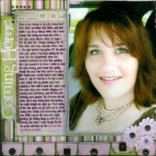
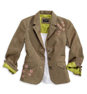
I couldn't wait for the kids to go to bed tonight so I could work on this week's challenge. This piece inspired me in a lot of ways on this layout. I decided to scrap this photo because it worked with the color scheme... my eyes were really green that morning, I was wearing a brown shirt, and the butterfly necklace had pink accents to match my pink lipstick. I have been wanting to do a layout with this photo anyway to talk about how it doesn't matter what happens on the road, coming home is always a good thing. I picked the KI papers to coordinate with the colors in the jacket, and used the olive green color as a background accent. I loved the big brown buttons on the jacket, so I used the Making Memories deco brads and some plain antique brads from JoAnns to add that sort of tailored look to the page. I added some whimsical stitching for a textile feel to the page, and the flower inspiration is probably a little obvious. My topic was even inspired by this piece simply because it reminds me of a work jacket, so that is why I chose a topic relating to work, and used the MM paper to pull in the brown colors and the work theme. My journaling and I had some issues to start with. I very carefully planned it in Publisher, printed it in brown on a test sheet to make sure I had the placement correct, and then I painted the background paper with a little pink paint to make sure the journaling was legible over the lines in the paper. The printing smeared on top of the paint, though, and left half of it illegible. I didn't want to make it look really weird by fixing it by hand, and I didn't have another sheet of the paper, so I printed a second sheet of the journaling in pink ink on a transparency, trimmed it closely, and carefully glued it down over the original journaling block. Now the brown smeared words look like shadows behind the pink, so that ended up being a happy blunder.
I used my Pages by Design system to plan the layout design. The tags across the bottom are inspired by the layout on the cover of the current issue of Creating Keepsakes. I loved the way Janet Hopkins lined the tags up, so I mixed up some different sized tags, painted them, and added them to mine. One of my own personal challenges is to get better use out of my magazine subscriptions. I have decided I want to make sure I complete at least one layout inspired by something I see in every single issue that arrives. My CK arrived today, so the timing was fortuitous... LOL
Thanks Maggie and Robyn ! This is such a great challenge!
Once again my scanner gets a great big F in the color reproduction department. The pink tags and flowers are not purply, but more like baby pink. AS soon as I can buy a new scanner, this one is so fired!


5 comments:
Jennifer - This totally rocks! Love the photo, and the colors worked perfect. Luv ya!!
Jennifer...this is an awesome layout and what a beautiful photo...
you look cute - great job on the LO! I really love those fashion file challenges but have yet to try one! love all the details!
Jennifer, I love it. The color of your eyes is gorgeous. Wendi
Post a Comment